Back to the work

Case notes · Web app

Asset Dashboard

Every asset I own lives in one spreadsheet I have kept for years. The sheet's own dashboard stopped being enough, so I built a real one on top of it: my net worth, the markets, and whether I am still on track to retire.

Google Apps Script · React · Google Sheets · Live and in daily use · Screenshots show sample data

Why it exists

The spreadsheet is the system of record for everything: every account, every stock lot, every bond series, every gram of gold, logged monthly for years. It is not going anywhere, and no app import wizard was ever going to replace it.

But a sheet answers one question at a time, one tab at a time, and the morning question is a compound one: what is the total, what did the markets do overnight, and am I still on plan for retirement. Answering that meant hopping across five tabs and a chart that always needed its range fixed.

So the dashboard is a read layer with zero infrastructure. Google Apps Script serves the page and reads the sheet, and nothing else exists: no server, no database, no deploy pipeline, no hosting bill. The sheet stays in charge; the dashboard just makes it answer faster.

The glance

The screen the whole project exists for: total net worth, how it moved since the last entry, and progress toward the retirement target, with IHSG, the rupiah, gold, and bitcoin on the same line. The number only means something in context, so the context lives next to it.

Each category card carries its own sparkline, drawn from years of monthly history that the spreadsheet has been quietly accumulating all along.
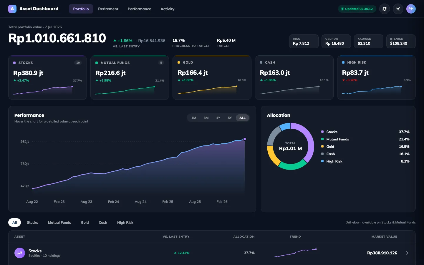
Asset Dashboard portfolio overview with net worth headline, market chips, and category cards with sparklines, sample data
The portfolio view: net worth, the markets, and every category at a glance.

Where the money actually sits

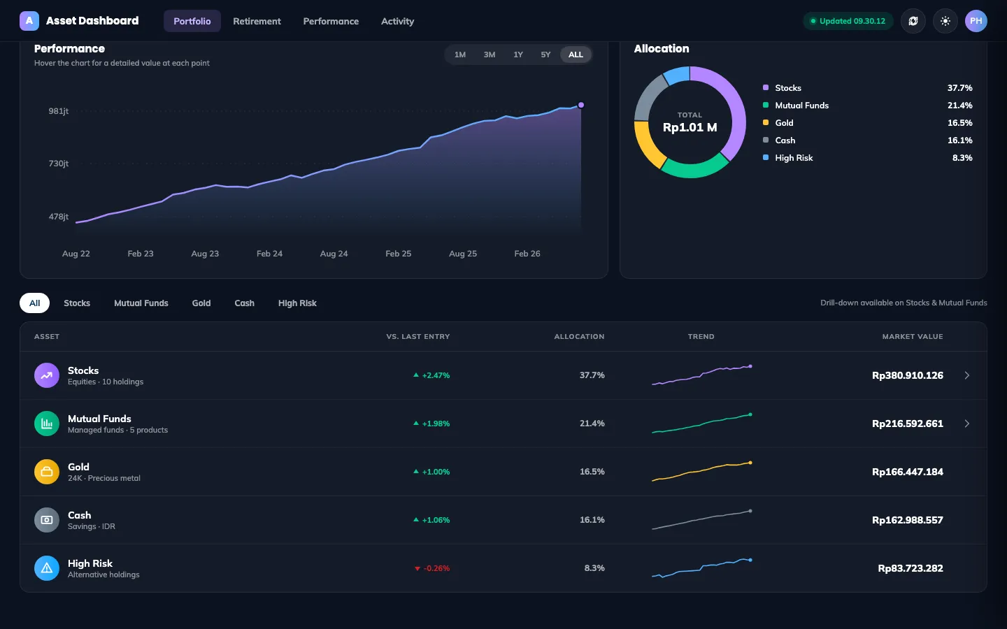
The allocation donut and the holdings table read straight from the sheet's own tabs: every stock lot, every bond series, every gram of gold. Stocks and mutual funds drill down to the individual holdings.

The dashboard never writes anything. The spreadsheet stays the single source of truth, exactly as it has been for years, and this page is just a better pair of glasses for reading it.

Asset Dashboard allocation donut and holdings table with per-category trends, sample data
Allocation and holdings: the sheet's tabs, made readable.

The honest yardsticks

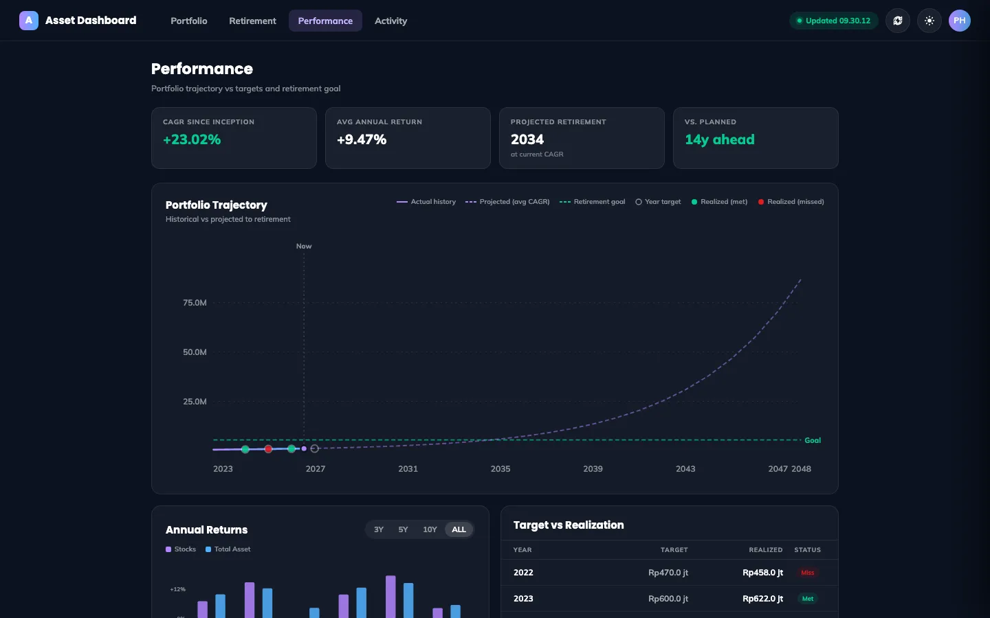
Yearly stock performance against total asset performance, and the year-end target against what was actually realized, including the years that missed. The trajectory chart projects the current growth rate out to the retirement goal and says how far ahead or behind plan that lands.

A dashboard that only ever shows green is a mood board. This one keeps the misses on the page, because the plan is only useful if it survives contact with the bad years.

Asset Dashboard performance page with portfolio trajectory, annual returns, and target versus realization table, sample data
Performance: the trajectory, the annual returns, and the misses kept honest.

The question behind the whole thing

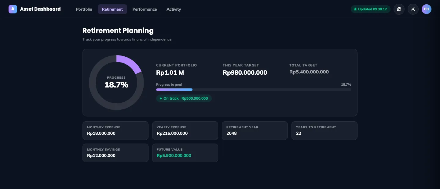
Retirement planning starts from planned expenses, works out the required net worth, and tracks this year's target from the plan sheet. The verdict at the top, on track or behind, is computed against what is actually in the accounts, not against optimism.

This is the page I check when I wonder whether a purchase matters or whether a bad market month changed anything. Usually the answer is: stay the course.

Asset Dashboard retirement page with progress ring, current portfolio versus targets, and expense and savings stats, sample data
Retirement: the plan, the progress, and an on-track verdict.

Daylight, for the desk

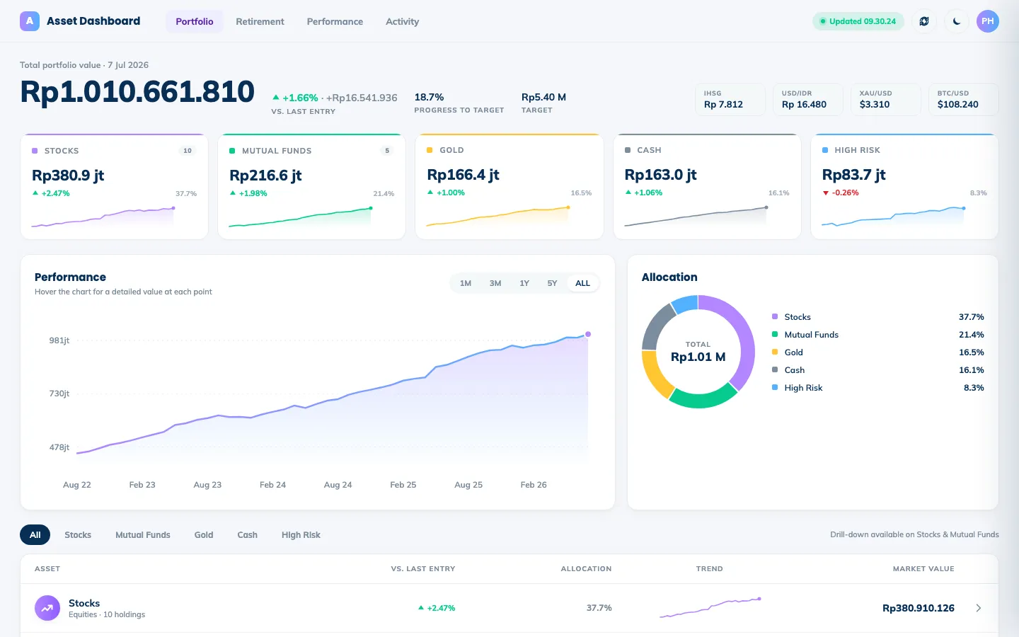
A light theme for daytime reading, persisted per device. Same data, same layout, drawn from the same theme tokens, because a dashboard checked every morning should not fight the room it is read in.

Asset Dashboard portfolio overview in light theme, sample data
The same glance, in daylight.

The hard parts

Zero infrastructure, on purpose

The spreadsheet is the database and Google Apps Script is the entire backend. The page ships as one HTML file with React from a CDN, no build step, no server, no hosting bill, nothing to patch. For a tool with exactly one user whose data already lives in a sheet, every piece of infrastructure I did not add is maintenance I will never owe.

Deriving everything client-side

Apps Script returns raw sheet rows; one pure function turns them into portfolio totals, category series, allocations, and sparkline data. The sheet's layout quirks stay quarantined in that single place, and every chart on the page is hand-drawn SVG, so there is no charting library to load or fight.

Market data from inside a spreadsheet runtime

Apps Script fetches Yahoo Finance for live prices on IHSG, the rupiah, gold, and bitcoin, and a daily trigger snapshots the portfolio into a history tab. The growth history the charts depend on builds itself, one day at a time, with no job scheduler beyond the one Google already provides.

Notes on the build

A single HTML file served by Google Apps Script, with React 18 from a CDN and Babel compiling in the browser. The backend is a set of Apps Script functions returning JSON from named sheet ranges, plus a daily trigger that snapshots the portfolio into a history tab. Dark and light themes, a ten-minute auto refresh, and hand-drawn SVG charts throughout.

If you want to talk about this build, or something you want built, say hello on WhatsApp or write to philip.kamdani@gmail.com.

Back to the work