Back to the work

Case notes · Mobile app

Hati Kita

A tracker for parents of a child with a serious liver condition, in the long monitoring that follows the Kasai procedure. It turns scattered lab reports, memory, and phone photos into one trustworthy record, so a parent can answer "is this normal for us?" in seconds.

React Native · Expo · Supabase · Recently launched · Screenshots show sample data

Why it exists

Biliary atresia is a rare liver condition. The Kasai procedure buys time, but it starts years of monitoring: regular blood work, watching for symptoms, the occasional hospital stay. The data that describes how a child is doing arrives as paper lab reports, remembered dates, and photos on a phone, scattered across all of them.

The name means "our liver," and idiomatically "our heart." The app exists so a parent can answer one question fast: is this normal for us. Not normal in general, but normal against this child's own history and reference ranges. And so that when they sit across from a doctor, they hand over a complete, organized record instead of trying to reconstruct it from memory.

Success is quiet: a parent feels a little calmer and more in control between visits, and never loses a data point that matters. One patient per account, in Bahasa Indonesia, built to be opened daily under real stress.

One glance, one answer

The home screen leads with a single status: stable, or something needs attention. A parent opening the app at 2am, one-handed, holding the child, gets the one thing that matters first, before any of the supporting numbers. The status card is tappable and takes them straight to whatever raised it, whether that is an out-of-range lab, a logged symptom, or an ongoing hospital stay.

Below it, the child's age, the count of currently abnormal labs, and whether a hospitalization is active. Two quick actions, add a lab result and note a symptom, are always one tap away because logging has to be fast enough to do mid-interruption.
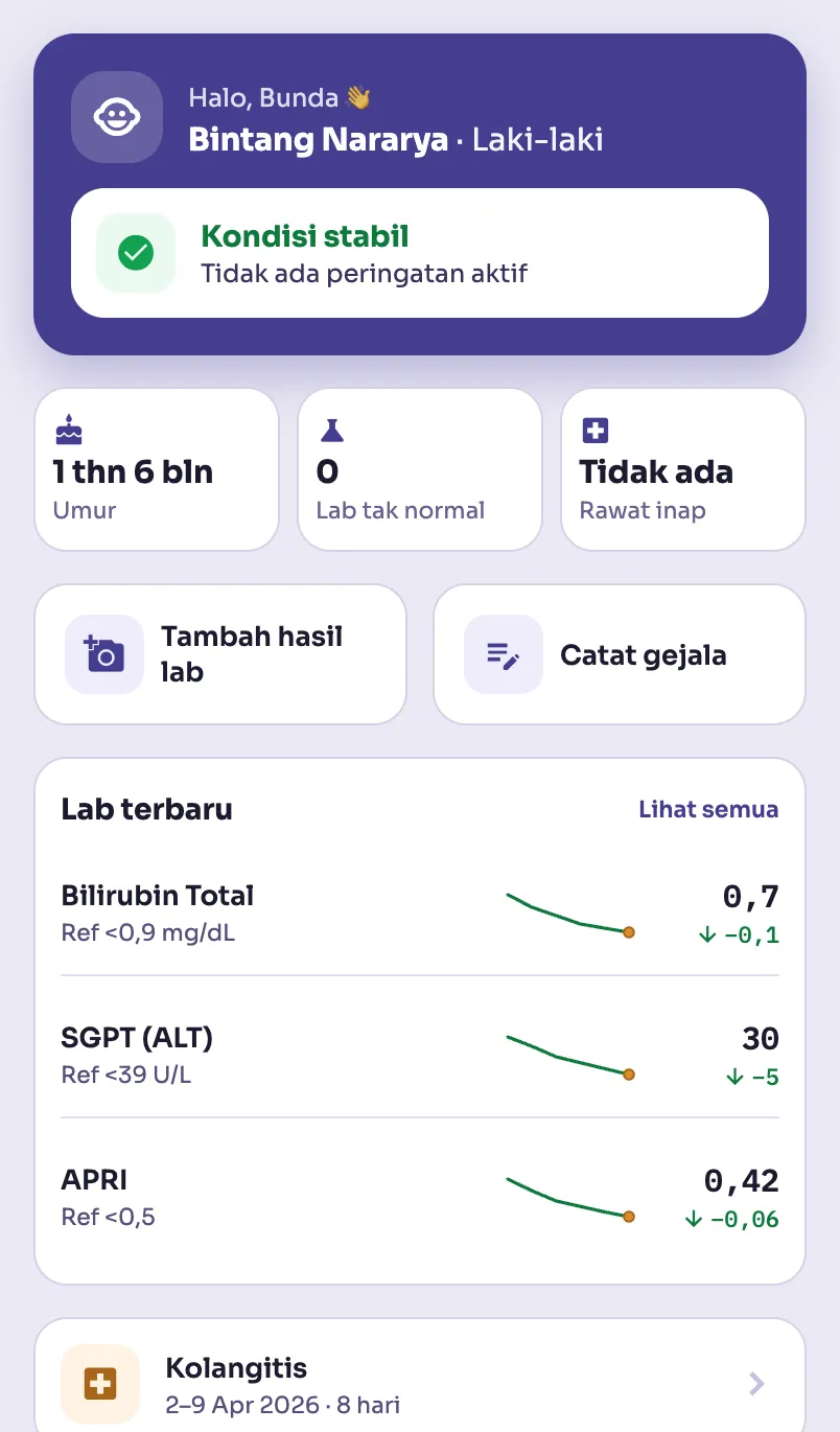
Hati Kita home screen with status card, stat tiles, quick actions, and latest labs, sample data
The home screen: the status first, then the numbers behind it.

A number is never alone

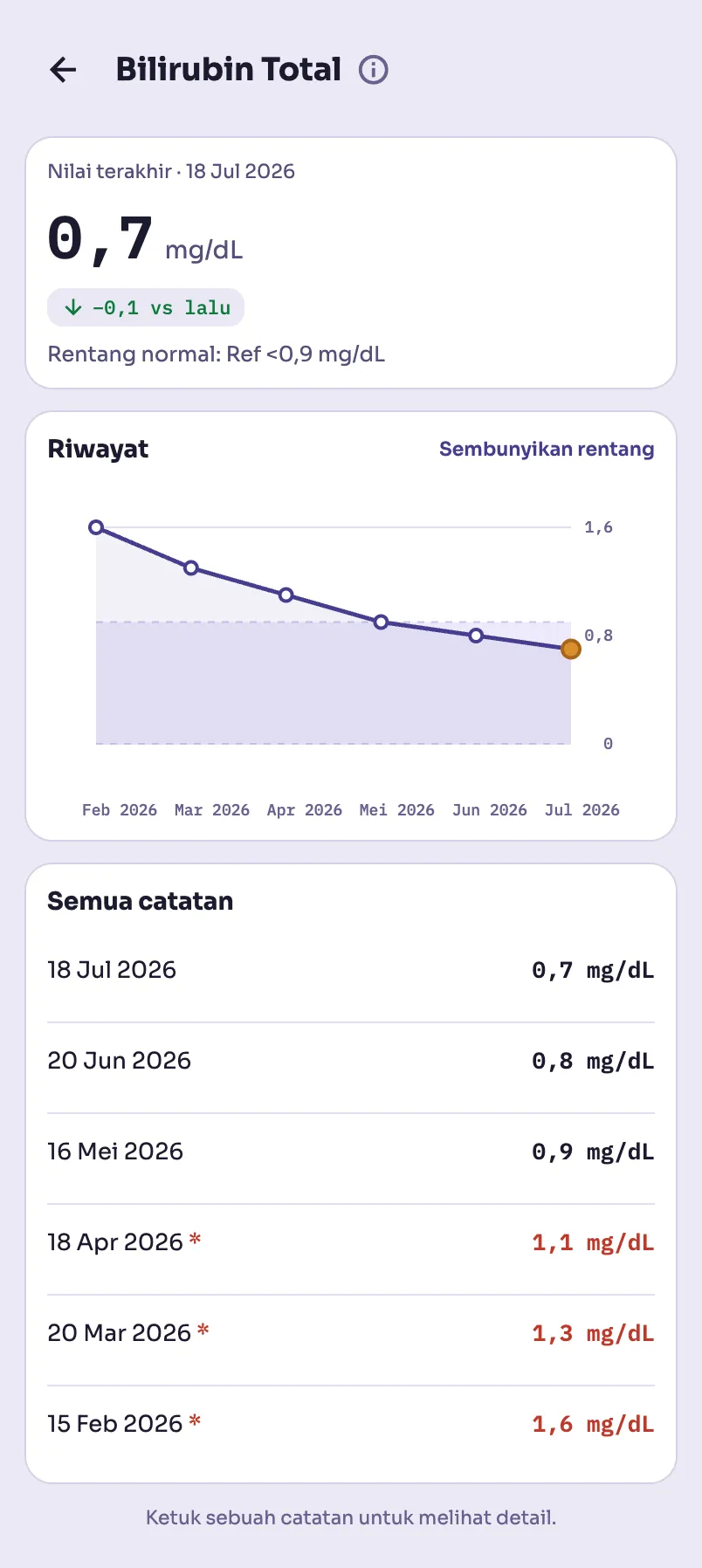
Each lab opens to its latest value, the change since last time, and the reference range on the same card, never a bare number floating without context. The trend chart draws the whole history against a shaded normal band, so "is this normal for us?" is a glance, not a calculation.

The catalog is specific to this condition: bilirubin, the liver enzymes SGOT and SGPT, gamma GT, and the APRI fibrosis score, each with the reference bounds that decide whether a value is flagged. A value out of range gets a plain-language note that says what it means and, just as importantly, that it is not automatically an emergency.

Hati Kita lab detail with latest value, trend badge, reference range, and history chart with a shaded normal band, sample data
A lab detail: the value, the trend, and the normal band together.

Symptoms, without the guesswork

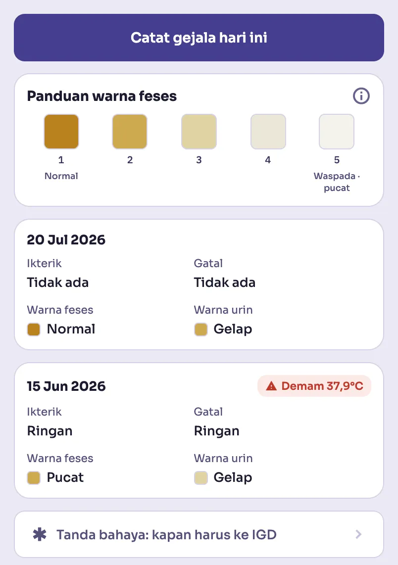
Stool color is one of the clearest early warnings in this condition, and it is exactly the thing a stressed parent second-guesses at the changing table. The symptom log pairs a color guide with every entry, and color is never the only signal, so it works for colorblind users and holds up under bad bathroom lighting.

A standing link to the danger signs, when to go straight to the ER, sits at the bottom of the log where it is found in a hurry, not buried in a settings menu.

Hati Kita symptom log with a stool color guide and past entries, sample data
The symptom log: a color guide on every entry, danger signs one tap away.

Every hospital stay, kept

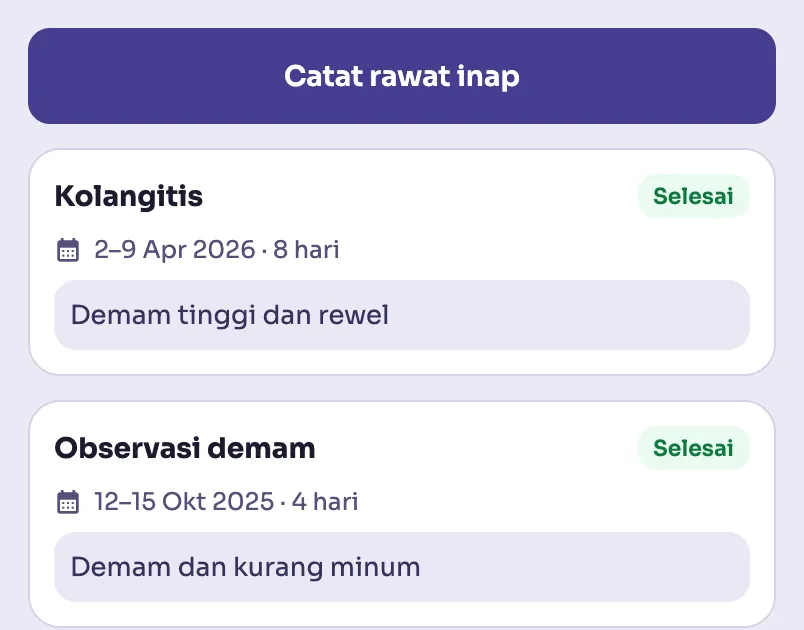
Hospitalizations are logged with their dates and details, and an ongoing stay surfaces on the home screen as its own status until it ends. The point is the same as the labs: nothing that matters gets lost between visits, and the next doctor sees an organized history instead of a shoebox of receipts.

Hati Kita hospitalization list with date ranges and durations, sample data
The hospitalization record: dates, durations, nothing lost.

The child, on one page

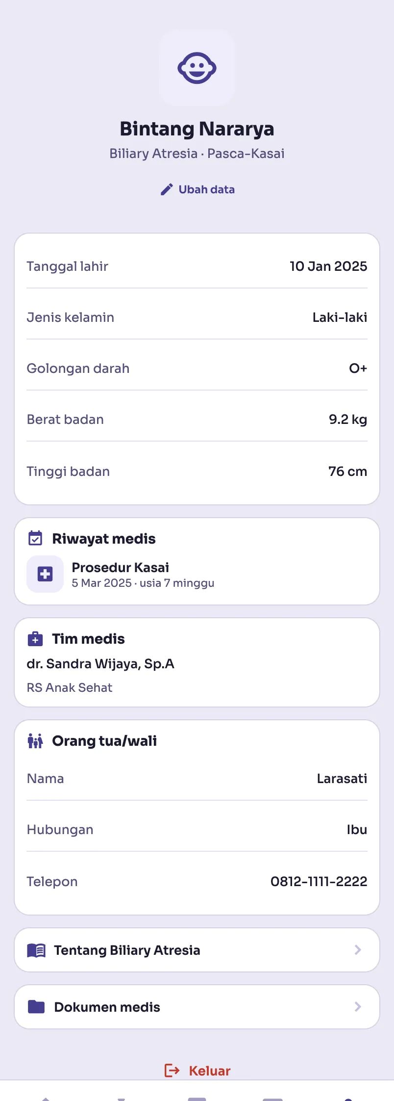
The profile holds the identity a medical team asks for every single visit: birth date, blood type, current weight and height, the Kasai procedure and the age it was done, the treating doctor and hospital. Medical documents attach here too, capped so the account stays lightweight.

A quiet footnote stays on the page: this is for personal monitoring, not a replacement for professional medical advice. The app is confident about the numbers and honest about its limits.

Hati Kita patient profile with vitals, Kasai procedure history, and medical team, sample data
The profile: everything a doctor asks for, ready before they ask.

The hard parts

Stale data is not current data

An abnormal bilirubin from four months ago is not a finding about the child today, it is old news. The home screen's abnormal-lab count deliberately excludes readings past a staleness threshold and surfaces them as their own quieter status instead. A tracker that treats a months-old value as a live alarm trains parents to ignore alarms, which is the opposite of the point.

Warm clinical, not cold clinical

The whole design walks a line between two failures: the sterile hospital portal that makes a scary diagnosis feel bureaucratic, and the cutesy baby-tracker that trivializes it. Soft surfaces, generous space, and honest trend lines carry the trust, with a single honey accent in the charts. Precision without coldness, reassurance without decoration.

One codebase, phone and web

Built with Expo and expo-router so the same code ships as a mobile app and a web build. That forced real discipline: react-native-web stubs out multi-button native dialogs, so destructive actions like removing a photo use a visible control that behaves identically everywhere, rather than a sheet that silently does nothing on the web.

Notes on the build

Expo and expo-router for a single codebase across phone and web, with Supabase for auth and storage behind one account per patient. The lab catalog encodes the reference ranges and trend direction for each value, and hand-built trend charts draw the history against a shaded normal band. Reduced-motion preferences respected, tap targets at the accessible minimum, and color never the only carrier of meaning.

If you want to talk about this build, or something you want built, say hello on WhatsApp or write to philip.kamdani@gmail.com.

Back to the work